Installation - Data Vis - Engineering
Layers of Light
A data sculpture using layers of acrylic to map locations in the United States according to their light pollution levels.
- When
- March 2026
- Where
- Parsons School of Design
Overview
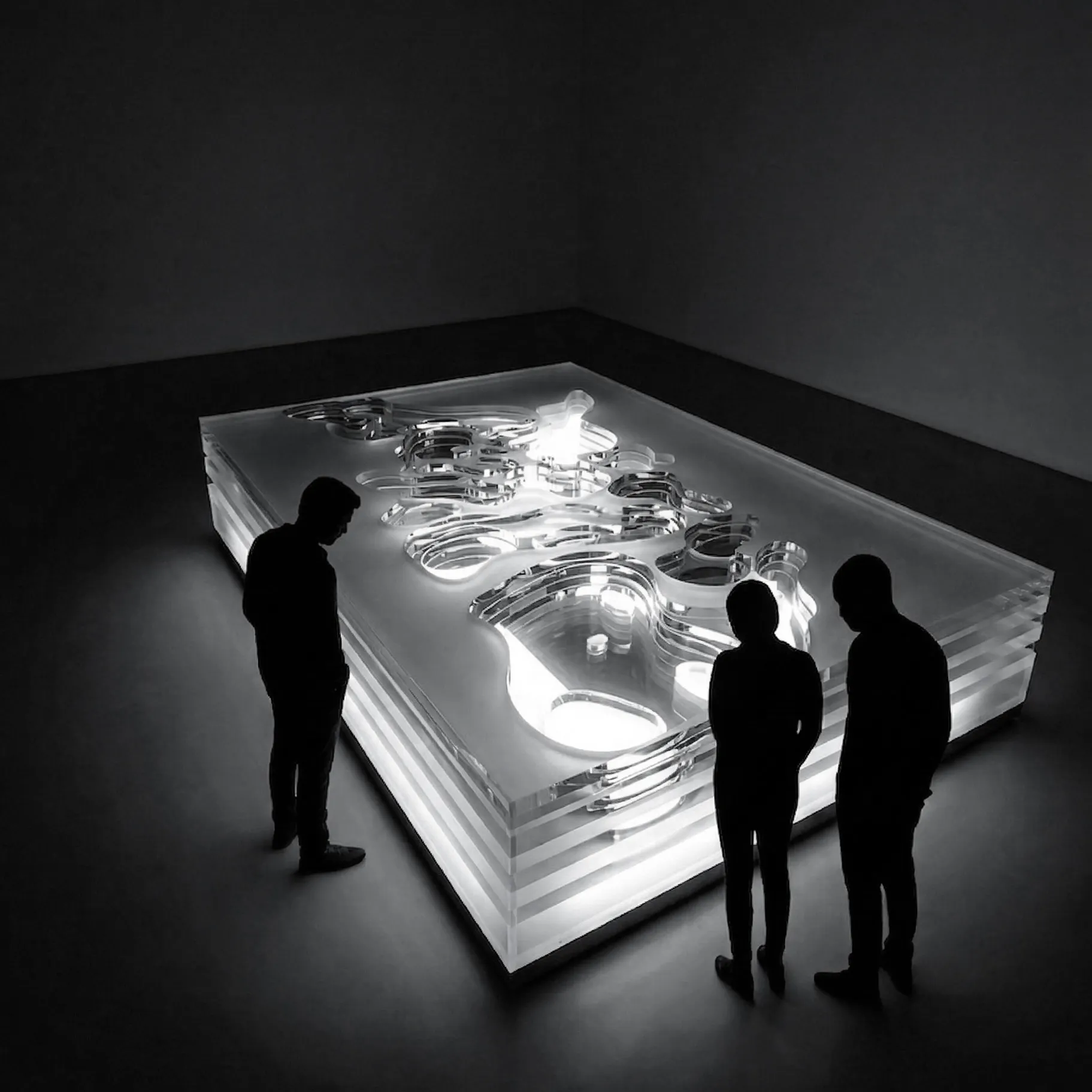
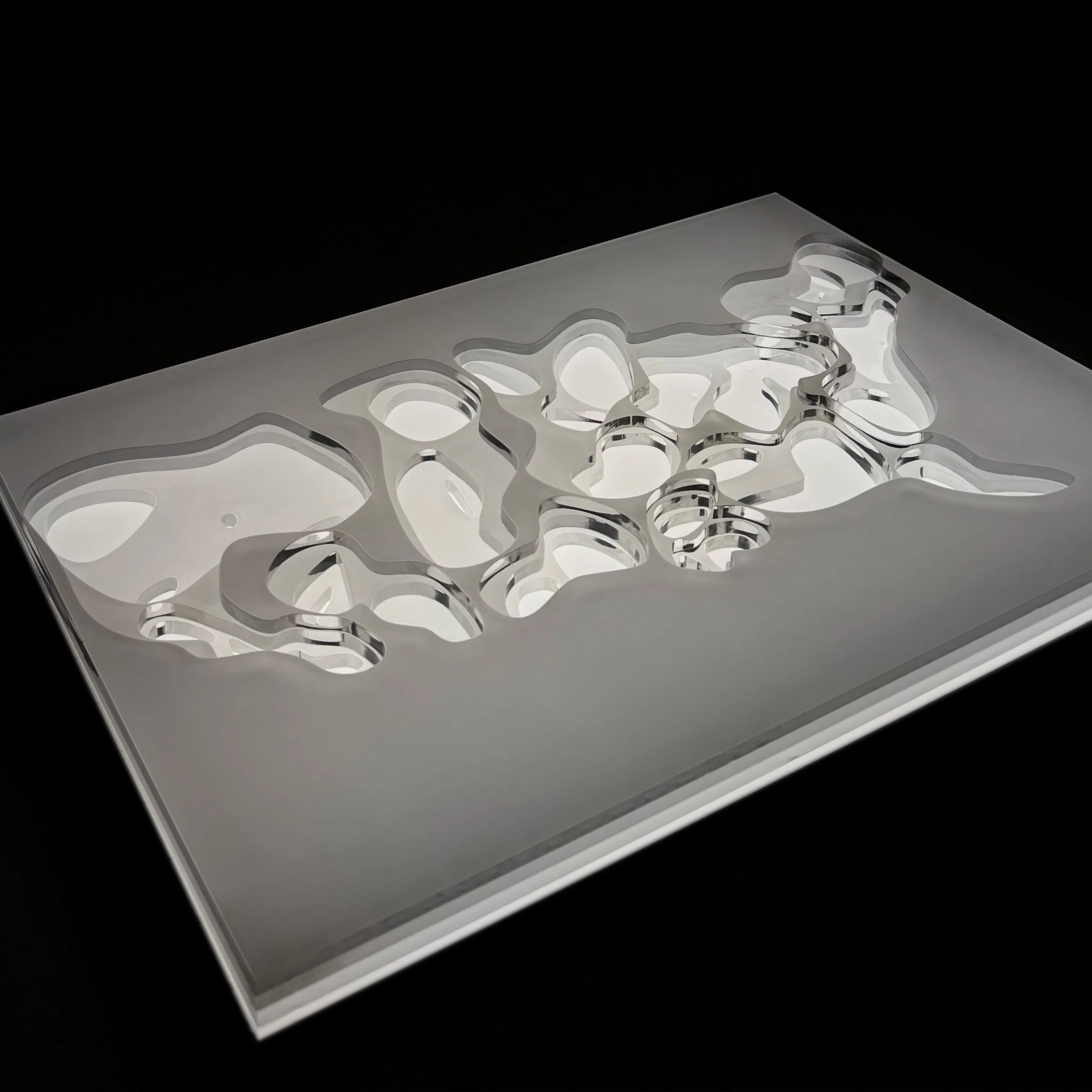
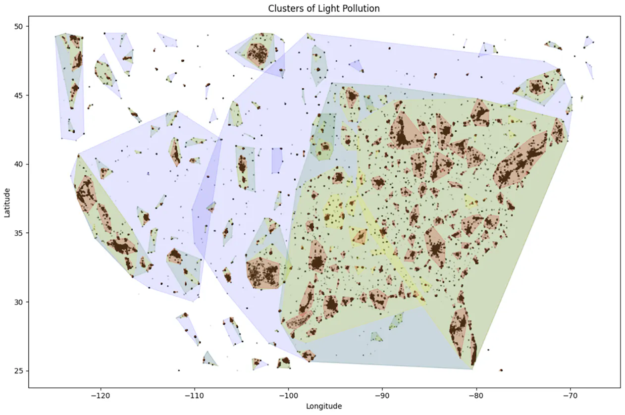
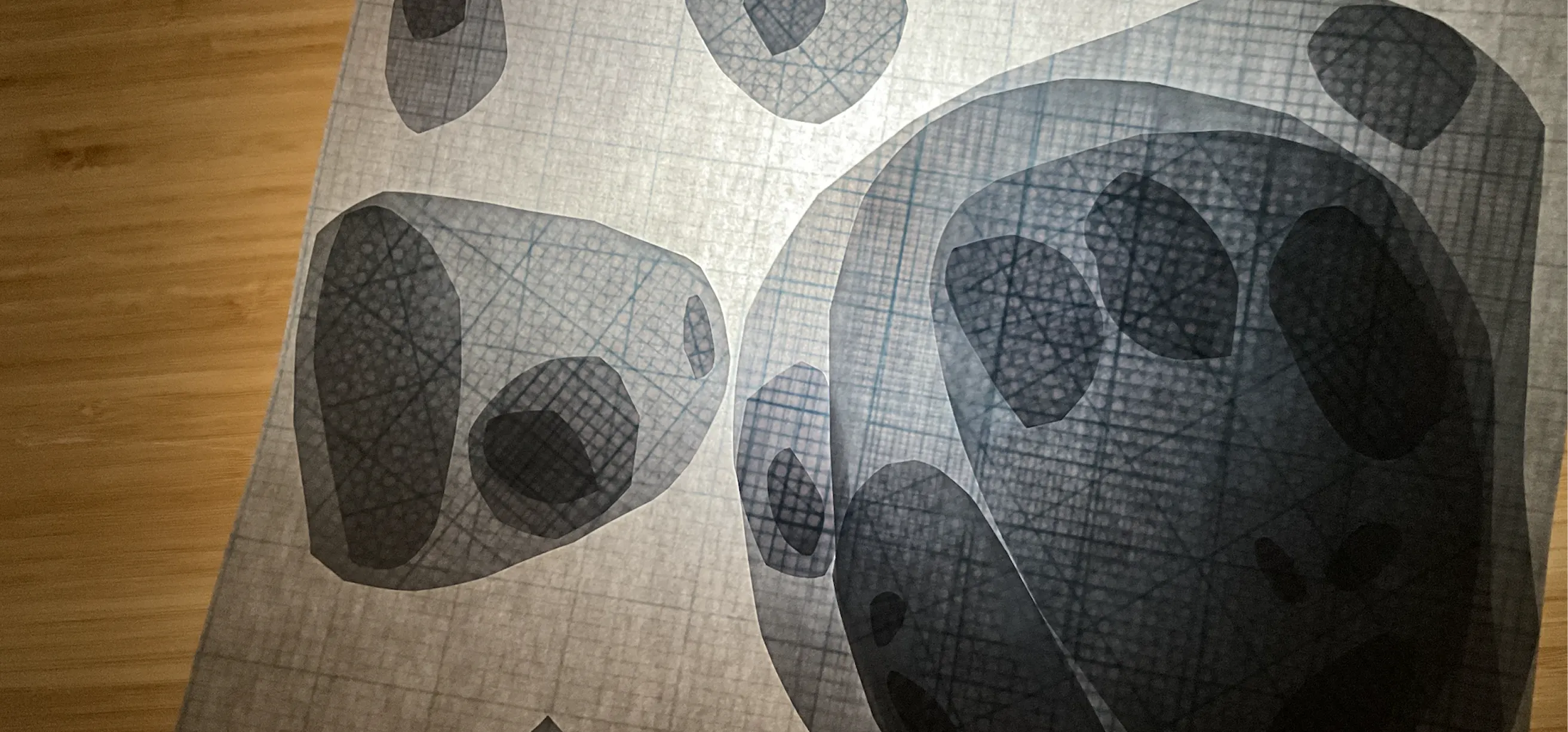
Using the Global Nighttime Radiance data from 2025, this project maps locations in the United States to their light pollution levels. Each layer of acrylic corresponds to a quartile on the polluted scale for this region, the least polluted layer visible at the top. Points are grouped using DBSCAN clustering into organic shapes that are cut away from each layer to reveal the light underneath. The areas with the highest levels of light pollution are visible from how much light shines through.
Data Prep
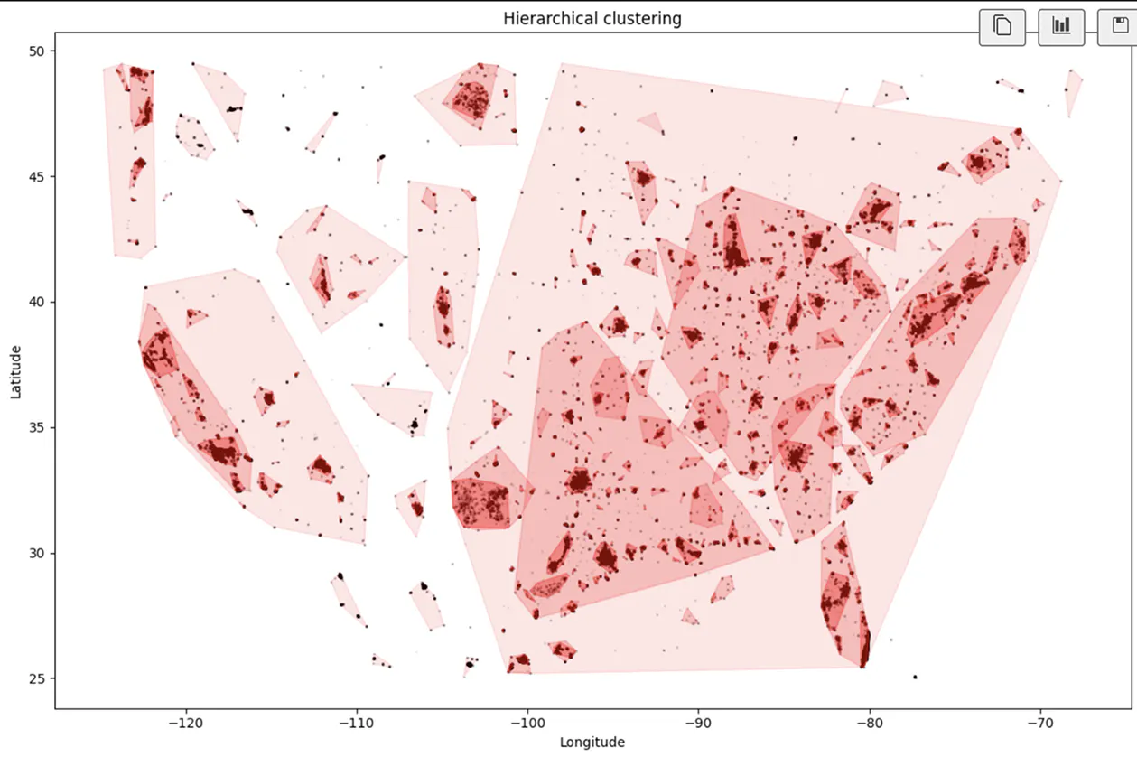
I experimented with different forms of clustering to group data points into areas that could be translated into the acrylic surfaces, using Python to process the data and initially bucket it into 4 groups, or layers, by pollution level. I ultimately decided to move forward with hierarchical clustering, which identified clusters by starting with the highest pollution levels and creating groupings of points within that layer, and iteratively moving to the next highest pollution level layer and gathering nearby points to each previously identified cluster.
The final cluster shapes were exported to an SVG, one for each layer, their edges smoothed, then prepared for laser cut using Adobe Illustrator.
Sketching and Prototyping
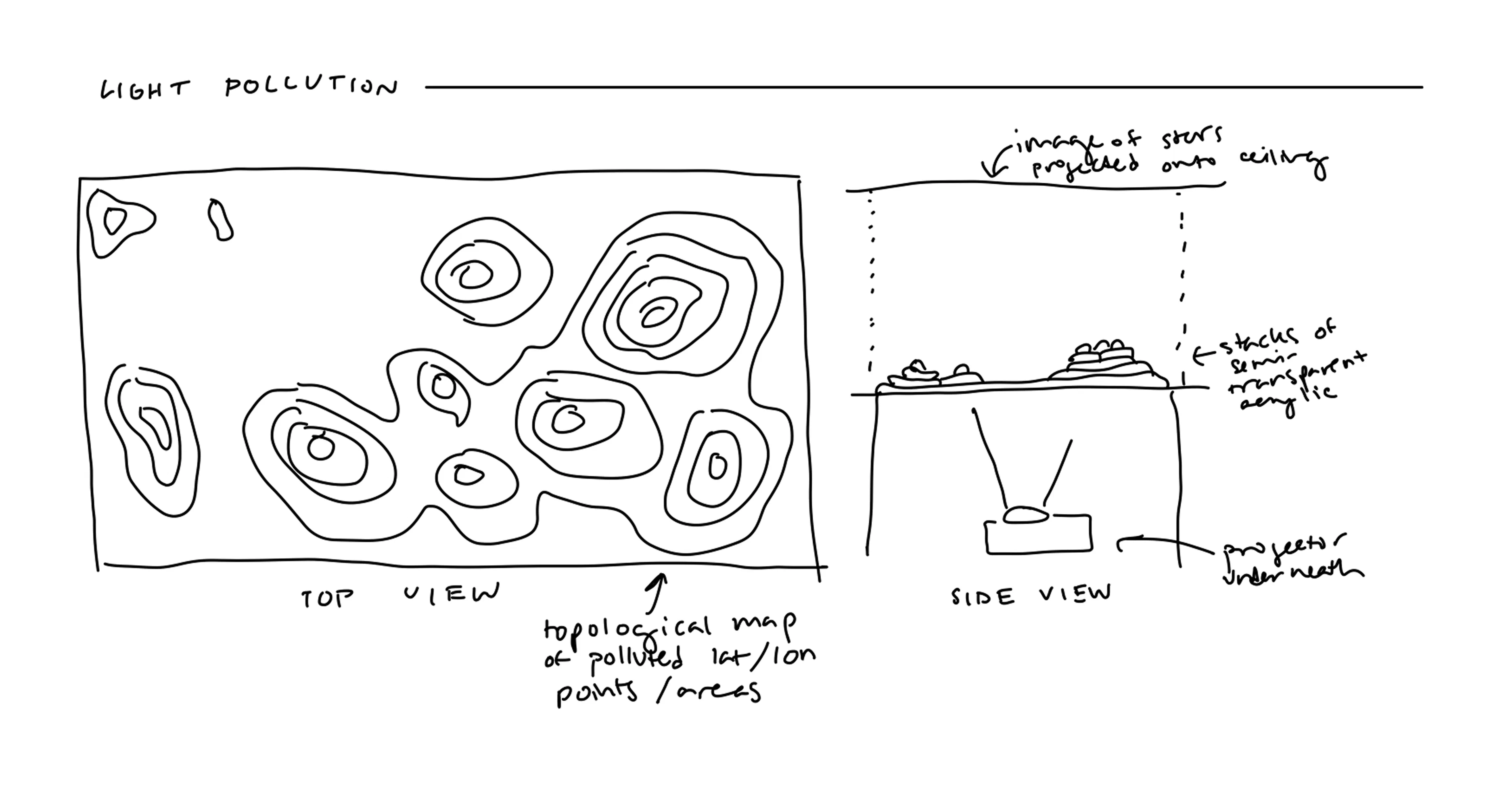
The initial concepts focused on how to use physical materials to show where development has physically gotten in between the natural environment, with light shining from below to both highlight and project an image onto the surrounding space. Paper prototyping resulted in flipping the initial layering method - the areas with higher light pollution levels should be letting more light through rather than the initial idea of the inverse.
Result
4 layers of uniformly engraved 12" x 18" acrylic, each with a range of pollution levels ranging from lowest levels at the top of the stack to highest at the bottom, showing depth of pollution and concentration across areas and lit from below with a lightbox.


Mockup
The ideal version of this sculpture is a large-scale installation in a dark room, with scale allowing for subtle engraving pattern differences on each layer that result in that different amounts of light being able to pass through each layer. Visitors should be able to walk around the map and see the layers and locations highlighted from a hidden light source underneath. Mockup was created using Google Gemini.