Design - Engineering
Rae's Roots
A brand and Shopify website for a tea company dedicated to helping people through pregnancy.
- When
- Jul - Dec 2022
- Where
- Freelance for Rae's Roots
Problem
Rae's Roots is a tea company based on Chinese medicine that aims to be a resource for people of color before, during, and after pregnancy. Coming into the project, they had packaging and a logo that reflected their mission in a way that the owner of Rae's Roots was happy with to be sold on e-commerce websites like Amazon, but this needed to be translated to a web brand and Shopify website to set up the company to achieve the potential that it has to be influential in the space. I partnered with my client to create those deliverables as an independent contractor.
Research & Discovery
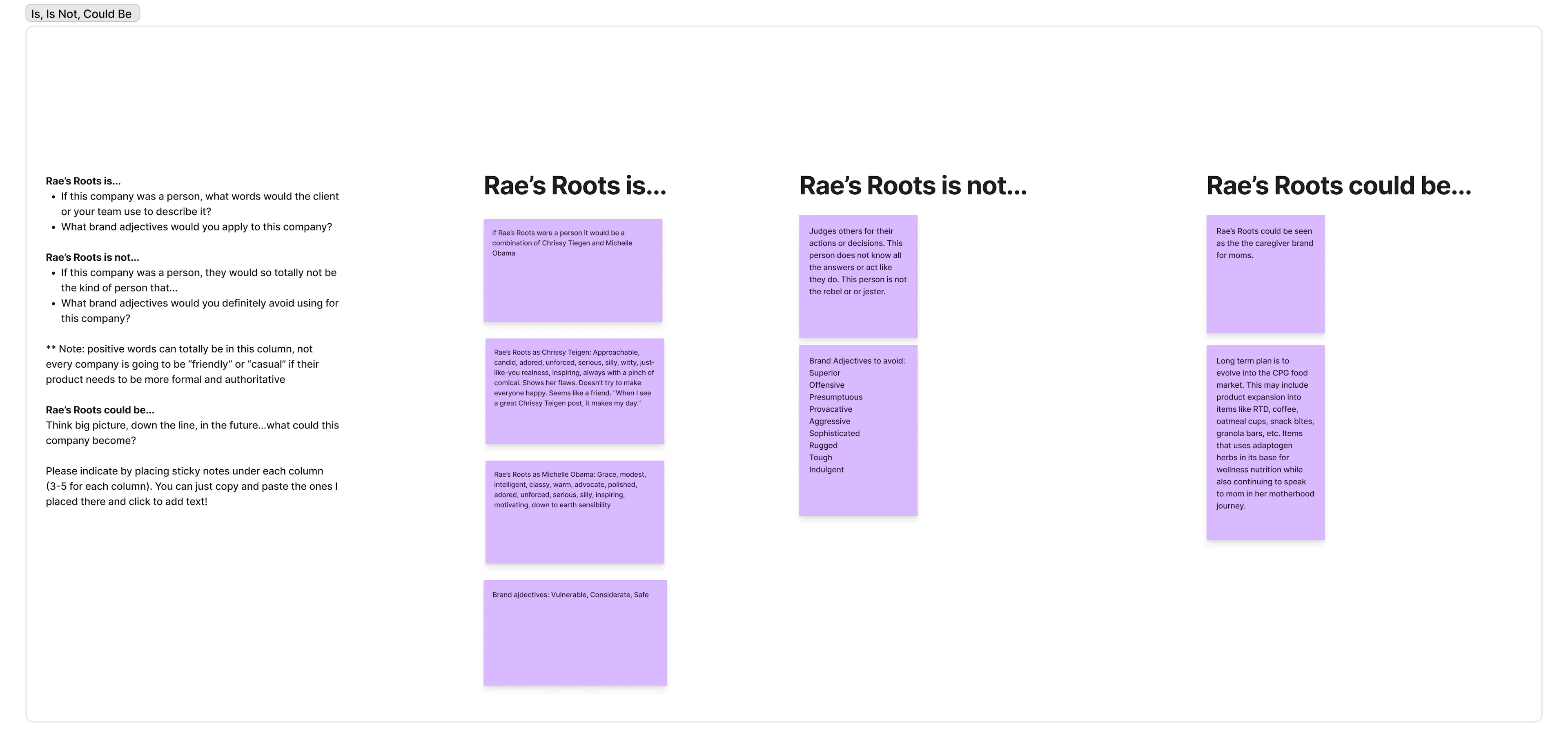
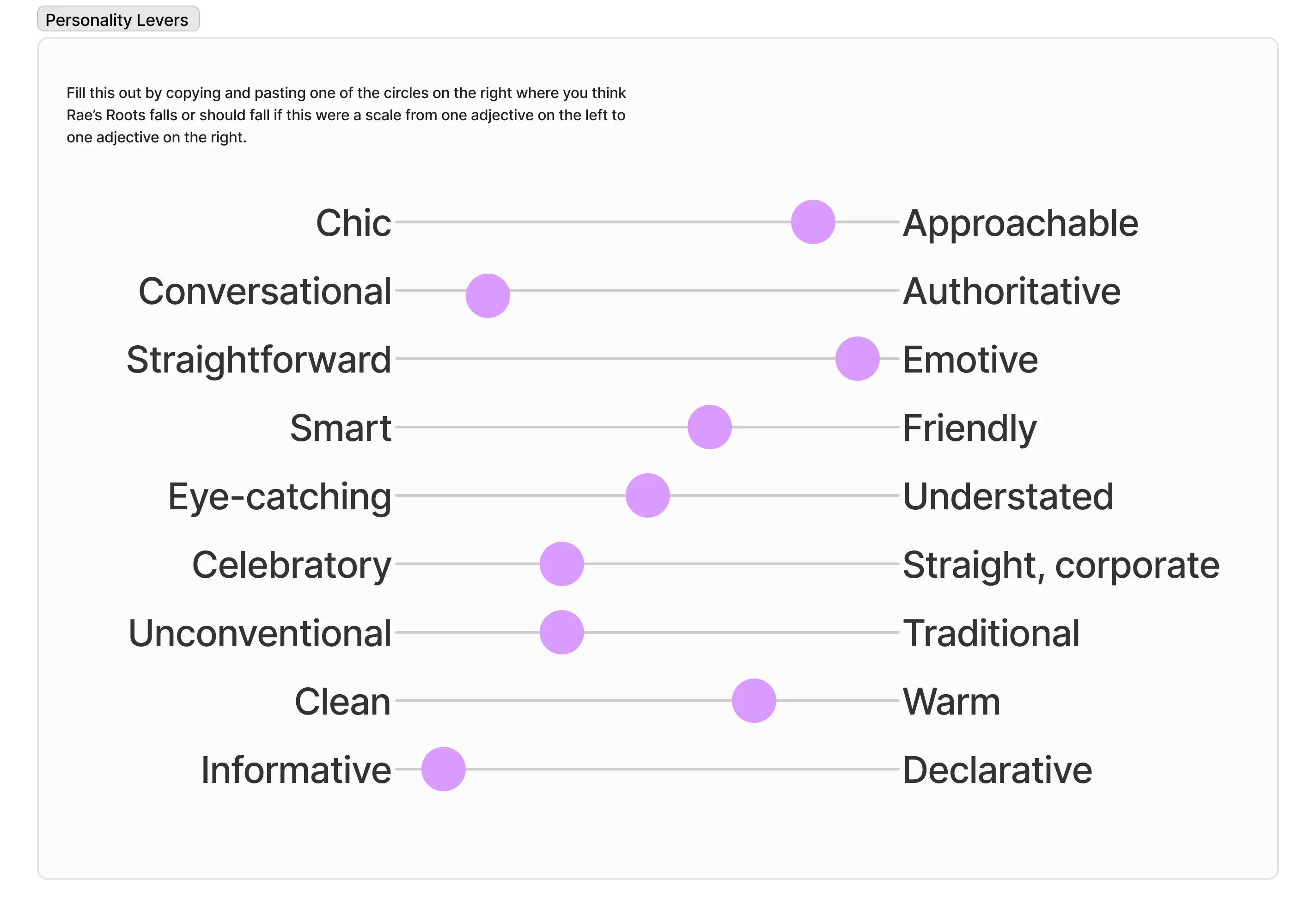
I began by asking the client to fill out a few brand exercises that helped me get an idea of what she wanted out of the final deliverables.
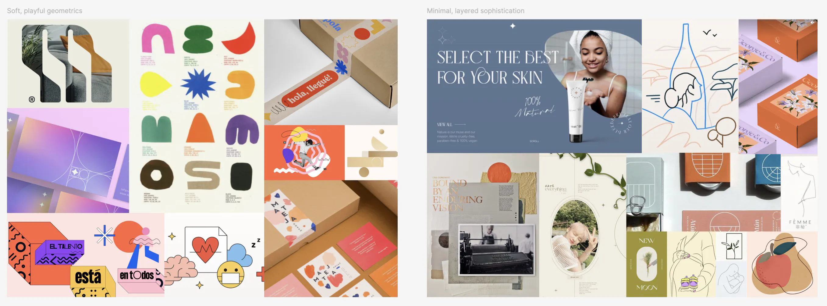
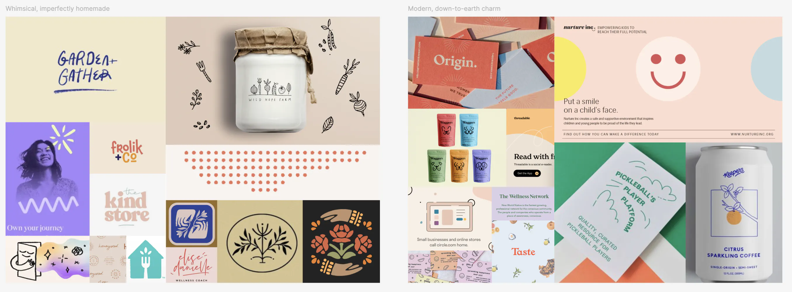
I translated these verbal descriptions to the curation of visual examples. Drawing adjectives and themes from the brand exercises, I created 4 different moodboards that visualized the different directions identified as part of the previous stage so that my client could select a direction or two to move forward with and guide the visual identity creation.
Process
Design
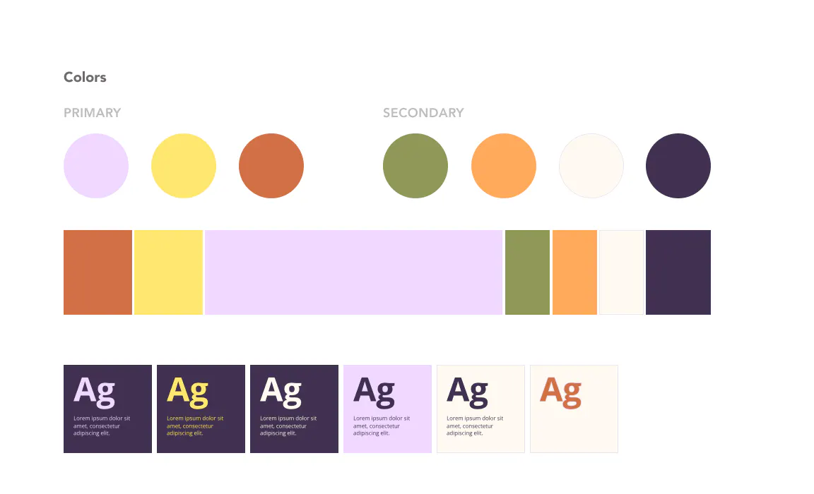
After collecting feedback from the client, I took this into the next stage of the project by using it as inspiration for creating a design strategy. We went through a few rounds of critique to settle on some visual rules to apply to the pages of the website. This design strategy highlights the balance of sophistication and playfulness that makes up Rae’s Roots. Contrasting spring colors with warmer, earth-toned shades brings the brand to life while keeping it grounded and reserved. Photos are treated as cutouts to put more emphasis on the subject of the picture rather than the background noise. The final design strategy was playful, earthy, and sophisticated.
While working on the design strategy, I created some low-fidelity wireframes to lay out how the content would be arranged on the website. After the design direction was finalized, I worked on applying the design strategy to the wireframes to produce a final prototype.
Development
The most important feature to my client was to be able to update all content independently, so I decided to use the theme-building experience that came with Shopify Online Store 2.0 to create the website. I built the theme using LiquidJS and created variables for all of the copy, images, colors, and products, leveraging the data types exposed by Shopify to have everything hosted in one place for my client.
Result
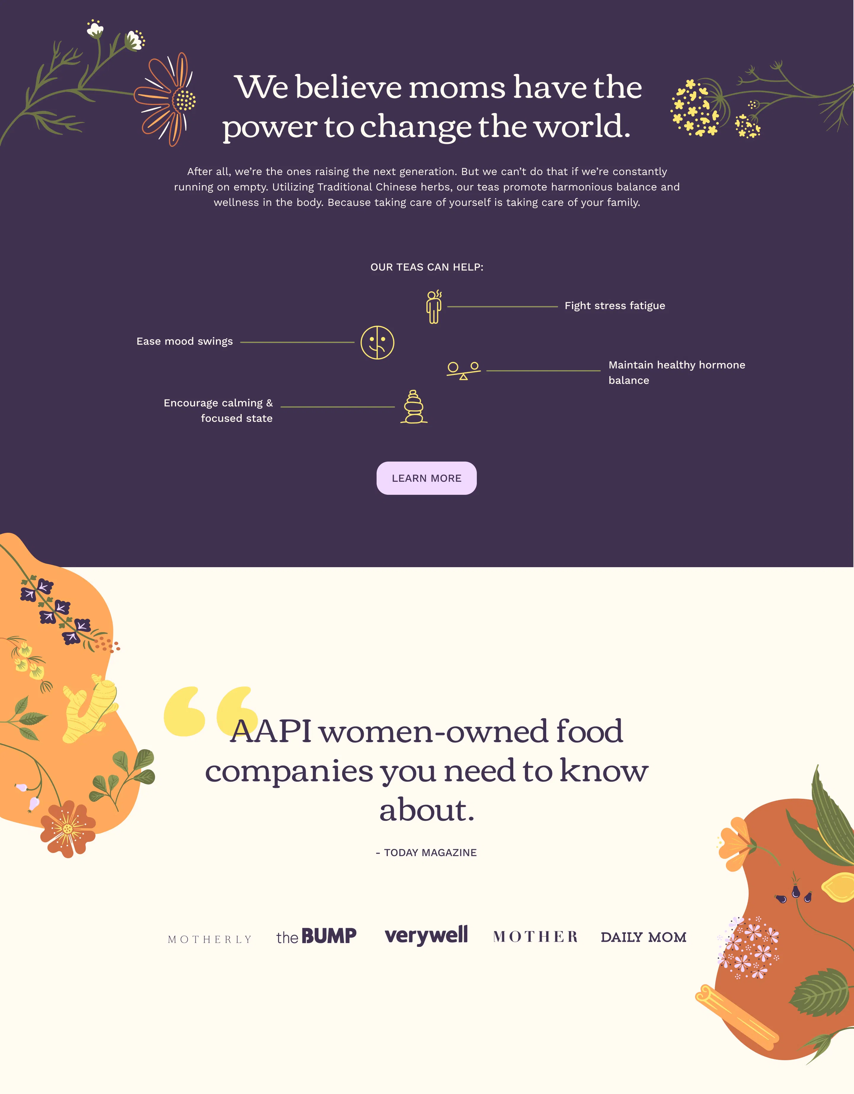
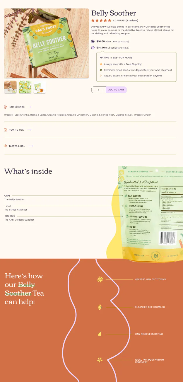
I translated the final prototype wireframes to the website using Shopify's content management system and custom theme builder. The final website visually explained the ingredients of each tea at a micro level alongside the core idea of the company and how its values and history connect to each individual product choice.
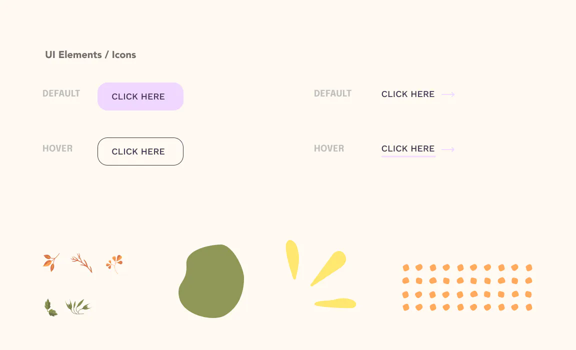
I also created a web brand book to hand off to my client so that any web design work can be consistent with what we created as part of this project, and to standardize visual identity so that future packaging can follow these brand guidelines.